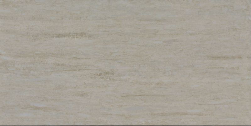
Featuring warm, rich, earthy tones, Taj Mahal is an intriguing Quartz surface that radiates natural beauty. Aptly named after one of the Seven Wonders of the World, it embraces the trend for nature-inspired interiors to bring balance to darker colour schemes and intrigue to paler palettes.
Packed with charm and character, Taj Mahal is perfect for kitchens and bathrooms and will make an impressive style statement in every interior. From islands, work surfaces and splashbacks to furniture, floors and walls, Taj Mahal brings functional beauty to any residential or commercial setting.
Like all the finishes within CRL Stone’s bestselling Quartz collection, Taj Mahal is an infinitely versatile, non-porous surface that is stain-, scratch- and heat-resistant. Ideal for busy households, it is durable and strong and also benefits from being incredibly easy to keep clean as well as ultra-hygienic.
Part of CRL Stone’s Silica Free Collection, Taj Mahal has a shiny, polished finish and is available in slabs measuring 1600mm x 3200mm and thicknesses of 20mm or 30mm.
For more details, call CRL Stone on 01706 863600, or visit www.crlstone.co.uk
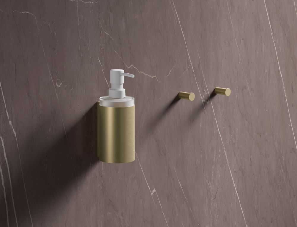
This autumn, bathrooms are moving beyond ‘white’ towards inviting neutrals, tactile textures and beautifully engineered fixtures, choices that not only feel luxurious now but also stand the test of time and enhance resale value.
With Nôsa’s new Terra Tile range—and acclaimed products across freestanding baths, basins, and showers—creating a design-led home spa is simpler than you think.
These six editor-approved trends, each paired with specific Nôsa designs, help you build a bathroom that’s seasonal yet timeless, stylish yet practical, and undeniably luxurious.
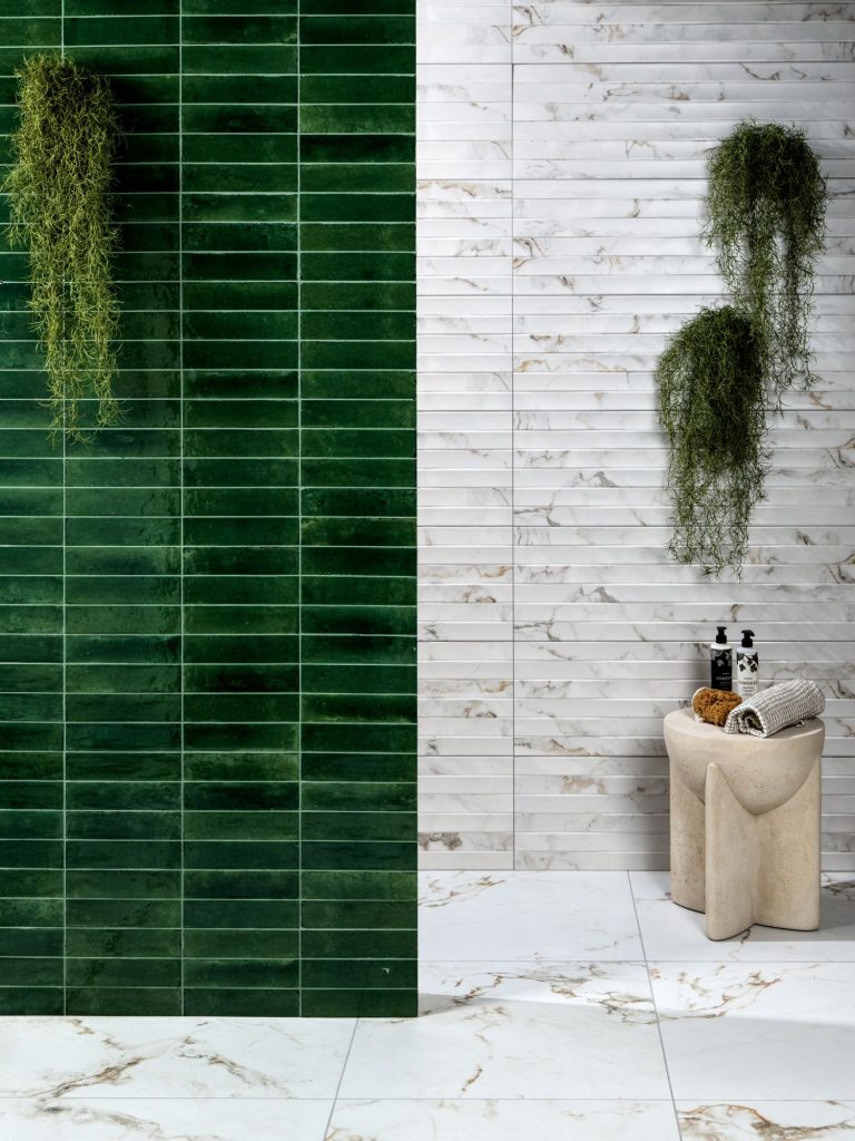
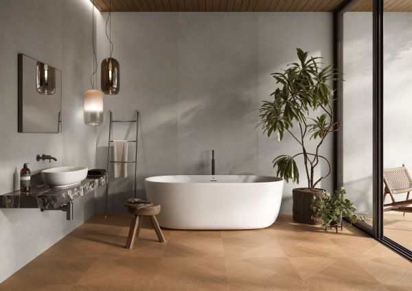
1. Small Changes, Big Warmth: Autumnal Metals & Smart Water Use
If a full refurbishment isn’t on the cards, aim for design-led upgrades. Autumn’s mood is all about depth and glow, which you’ll get instantly from refined metal detailing.
Try Elche Metal porcelain tiles (pictured at the top) to add dramatic, light-catching accents to a splashback or feature wall. Layer with the Faro robe and towel accessory range, plus matching bathroom shelves.
Upgrade with eco-conscious technology: Nôsa’s thermostatic showers are not just sleek but excellent for smart water usage and a more stable, energy-efficient experience.
Why it adds value:
Quality brass and thermostatic controls read as “future proofed.” Buyers appreciate comfort and cost-savvy engineering.
2) Trade Stark White for Warm Neutrals
Swapping out cold whites for mineral-rich neutrals creates instant calm. For example, try out a hero vanity such as the Cappuccino Missoni for a warm, contemporary unit that anchors the room without shouting.
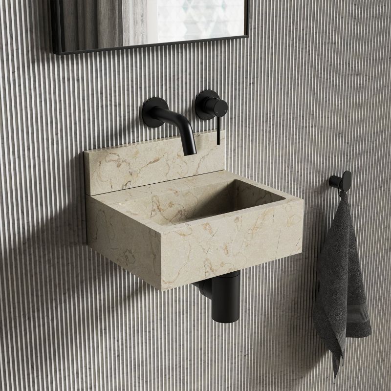
For compact cloakrooms: Nobu Crema Marfil wall-hung marble basin (pictured below), brings sculptural luxury in smaller bathroom or cloakroom spaces.
Underfoot or on feature walls: Nôsa’s Alicante Macchia porcelain tiles deliver soft movement and warmth.
Design note: Warm neutrals give you longevity. They’re friendly to changing trends, fantastic for everyday use and future resale.
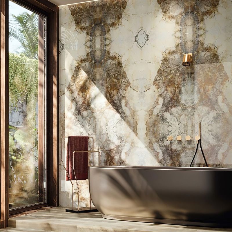
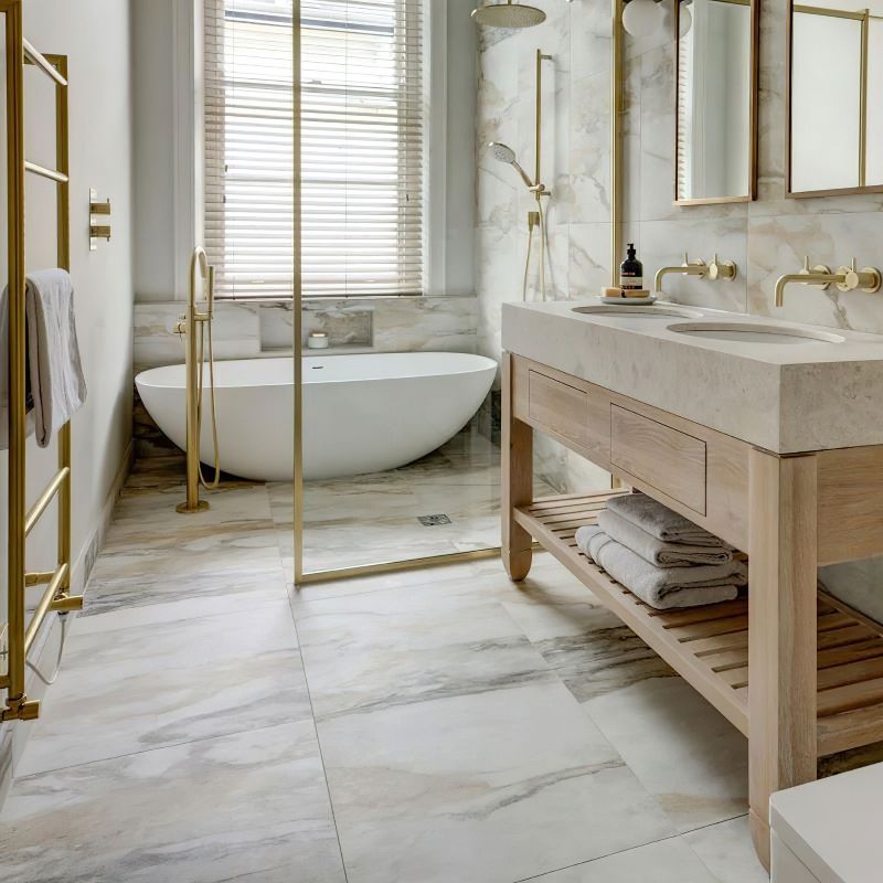
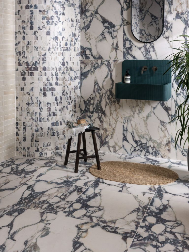
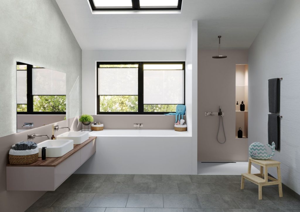
3) Go Large Format for a Seamless, Spa-Like Sanctuary
Large-format tiles reduce grout lines, making rooms feel bigger, calmer and easier to clean. A statement surface, such as the Madrid Gold porcelain tiles from the Terra Tiles collection (pictured below), adds sophisticated golden veining, warmth, and decorative detailing. Ideal for a master suite when you want a “hotel room” at home.
Value: Seamless surfaces and simple maintenance are perennial buyer pleasers; clean architecture never dates.
4) Add Tactile Texture and Instant Design Credibility
Luxury textures are how you turn ‘nice’ into designer-inspired, home spa environments. Nôsa’s Terrassa Rib Cut beige porcelain tiles introduce natural movement, perfect for a feature wall behind a vanity unit. The warm tactility reads bespoke, while staying neutral.
Why it works: Texture adds shadow play and depth, creating a softly lit “spa vibe” that feels premium all-year-round.
5) Dial Up the Drama with Deeper Tones & Sculptural Forms
Autumn is prime time for shadowy hues and statement pieces that elevate the everyday and, crucially, refresh dated bathrooms. The Senna Carbon Fibre freestanding bath, a limited-edition centrepiece featuring sleek, contemporary lines.
Architectural basin: The Rico Pietra Grey Marble wall-hung basin brings dramatic natural stone veining in a crisp silhouette.
Finish the picture: Add the Faro Matt Black wall-hung rimless toilet for a clean, modern profile.
Resale value: One or more memorable focal designs—i.e., a freestanding stone bath and architectural accessories – complemented by coherent dark hardware create a designer bathroom that photographs, feels, and sells beautifully.
6) Embrace Greens & Organic Woods for Grounded Calm.
Green is the serene neutral of 2025 and beyond, especially when paired with wood tones. Nôsa’s Vermont Olive Green freestanding stone bath is celebrated for its natural hue and heat-retaining properties for longer, more relaxing soaks.
Underfoot: Try the Pamplona Khaki Porcelain floor tiles, brings the warmth of timber with the practicality of porcelain.
Why it lasts: Nature-inspired palettes sidestep trend fatigue. They’re calming, photogenic and age gracefully with the rest of your home.
Timeless Bathroom Design Adds Real Value to Your Property
A beautiful bathroom is more than a mood; it’s a smart upgrade. Here’s what buyers notice:
Materials that age well: porcelain, engineered stone, and real marble details in calm palettes.
Water-smart engineering: thermostatic showers and quality brassware signal lower running costs and thoughtful specification.
Low-maintenance surfaces: large-format tiles and wall-hung fixtures read clean and modern.
One signature piece: a design-led freestanding bath or sculptural basin gives the room identity
Cohesive hardware: consistent metals (brass, copper, matt black) create a high-end finish without full renovation.
Ready to warm up your bathroom for autumn and future-proof it for years to come? Explore Nôsa ’s Terra Tile range and design-led baths, basins and showers, or book a design consultation to create a scheme tailored to your space.
Terra Tile Samples
Customers can order samples to test tone and texture in actual light.
Surface solutions manufacturer Cosentino has launched a new mineral surface brand, Éclos®, aimed at the kitchen and bathroom countertop market. Incorporating more than 50% recycled materials, Éclos combines a 3D integrated design with a crystalline silica-free composition, introducing an entirely new category which it terms: “Inlayered Mineral Surface”.
Éclos follows the launch of Silestone in 1990 and Dekton in 2013, and is said to represent a further breakthrough in the evolution of architectural and design surfaces. Its development involved 50 specialised researchers, required more than 28,000 hours of research and more than 1,500 hours of testing from the company’s Research & Development and Product departments.
“Since our founding, we have been committed to leading innovation rather than following trends; just as we did with Dekton® and most recently with Hybriq+® technology for Silestone®. Éclos® involves a new turning point for our industry, an evolution that responds to real market needs and anticipates the future”, says Pilar Cosentino, Cosentino Group CEO.
Inlayr® Technology: layered design with 3D realism
Inlayr® technology enables Éclos® to be manufactured using a layered design system. Thanks to an advanced robotics engineering process and innovative decoration techniques, it gives the entire surface a 3D design with unique veins and patterns, as well as unprecedented depth and consistency. The result is a surface with a three-dimensional design integrated into the edges, with realistic aesthetics and a natural touch and feel that redefine industry standards.
Pioneering composition: zero crystalline silica
Éclos® also introduces a groundbreaking development in the composition of mineral surfaces. The first collection, which will be available globally in the coming months, has zero crystalline silica in its formulation. Furthermore, all colours use a minimum of 50% recycled materials, while several colours incorporate almost 90% recycled materials, demonstrating Cosentino’s dedication to the circular economy.
Its composition and the formulation developed specifically for this new product give Éclos® better flexibility, ductility and impact resistance, making it easier for fabricators and industry professionals to handle and install.
Additionally, through Inlayr technology, Éclos offers superior heat resistance, which can withstand temperatures up to 220°C, including direct contact with cookware immediately after use. This makes it an ideal solution for kitchen countertops, both commercially and at home.
A paradigm shift in a changing global industry
In a context shaped by protectionist policies, tariff disputes, and growing concerns about the safety of materials like quartz, Cosentino is once again leading the way with Éclos. This new surface category aims to transform the sector, offering a safe, sustainable, and beautiful design with high added value.
According to recent reports, the global countertop market is expected to grow at a rate of 3% annually until 2028, reaching a value of $50 billion and a total area of 650 million square meters, of which 100 million square meters will be comprised of mineral and porcelain surfaces. The US will remain the largest market, while the largest growth is expected in the Asia-Pacific region, the Middle East, and developing countries.
Ca’ Pietra has introduced two new tile launches: Foundry Novo and Savoy Novo. One is glossy and glamorous, while the other features an opulent and luxurious marble effect. Both are packed with personality and ready to bring your interiors to life.
Foundry Novo is an evolution of the beloved Foundry collection. Retaining the artisanal glazes and signature irregular edges of the original, the new range adds a polished finish and is available in six eye-catching colours. From inky Navy to deep Irish Green and soft tones like Linen and Beige, each tile boasts handcrafted charm and a shimmering glaze. Foundry Novo is ideal for creative layouts – whether stacked, staggered, or colour-clashed – offering endless styling potential for walls and floors.
Also debuting is Savoy Novo, a luxurious porcelain tile range inspired by Ca Pietra’s popular Calacatta Viola marble. With dramatic wine-purple veining and a creamy white base, this tile captures the opulence of natural stone, without the price tag or the upkeep. Available in three formats – large slabs, classic squares, and an elegant curved mosaic – it’s perfect for creating a show-stopping feature in any space.
Rectangle: 60 x 120 x 0.8cm
Square: 60 x 60 x 0.8cm
Mosaic: 30 x 30 x 0.8cm
Suitable for: Interior walls and floors
Both new launches reaffirm Ca’ Pietra’s reputation for surfaces with substance, style, and standout appeal.
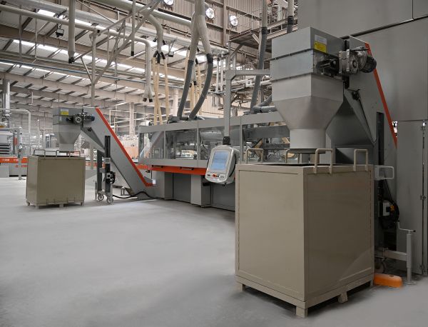
RAK Ceramics has announced the launch of its next-generation slab production facility, featuring the advanced Continua+ PCR 2180 technology, which marks a significant upgrade in its large-format slab manufacturing capabilities. This milestone further solidifies the company’s commitment to innovation, efficiency, and sustainability.
RAK Ceramics was one of the first in the world to adopt Continua technology in 2012 and the first to introduce large-format slabs in the Middle East with its pioneering Maximus product range. This initial step revolutionised the regional ceramics market and positioned the company at the forefront of slab innovation. Since then, RAK Ceramics has continuously expanded its slab portfolio, leveraging Continua to improve design flexibility, production efficiency, and digital capabilities.
A New Era in Slab Manufacturing
The newly operational facility leverages Continua+ PCR 2180, one of the most advanced and efficient slab production technologies available today. This technology ensures high productivity with minimal material wastage and enables full digital synchronization at every stage of production, allowing for precision and flexibility in manufacturing.
In a bid to enhance sustainability, the facility features a seven-layer horizontal dryer, designed to operate on total heat recovery from the kiln, significantly reducing fuel consumption while optimising energy efficiency. The new line is evaluated to be more energy efficient in comparison to current continua setup.
Industry-First Digital Advancements
The slab production facility boasts state-of-the-art digital glazing technology, enabling the combined application of inks and materials. This innovation enhances design capabilities, offering high-definition patterns, deep digital structures, and advanced dry digital glaze/granule applications. Additionally, the facility incorporates multilayer granule application technology, fully synchronized with digital processes, ensuring uniform and seamless finishes across all slab productions.
Largest Kiln in the Middle East & Smart Manufacturing
RAK Ceramics has also introduced the longest European kiln in the Middle East, stretching 300 meters, reinforcing its high-capacity production capabilities. The facility integrates a smart scheduling storage system, incorporating real-time control and monitoring to enhance operational efficiency. A fully automated quality control system eliminates manual inspections by monitoring tiles at multiple production stages, ensuring unmatched product quality.
With the launch of its first-ever matting line for slab production, RAK Ceramics has standardized processes to maintain uniform finishes across various slab sizes. Additionally, the auto cutting line ensures consistency in customized product formats, optimising the production process.
Advanced Packaging & Sustainability Initiatives
The newly launched facility also features an automatic shrink hood wrapping machine, eliminating manual packaging processes and improving efficiency. Its advanced packing line supports multiple palletization methods, including A-frames, L-frames, and wooden boxes, with a robotic arm for seamless logistics management.
With an annual production capacity of 4 million square meters, the facility is equipped to manufacture slabs in multiple thicknesses ranging from 6mm to 20mm, with a maximum size of 180×360 cm—currently the largest in the industry. Standard slab sizes include 162×324 cm at 12mm thickness, as well as 80×320 cm uncut slabs for countertops. To further enhance durability, mesh reinforcement is applied to all 162×324 cm slab productions.
A Strategic Leap Forward
The launch of this 100 million AED facility represents a strategic investment in the future of slab manufacturing, reinforcing RAK Ceramics’ position as an industry pioneer. By integrating IoT-enabled smart manufacturing, zero manual intervention for quality inspection, and enhanced digital glazing techniques, the company continues to push the boundaries of innovation, efficiency, and sustainability.
This milestone reflects RAK Ceramics’ ongoing commitment to providing cutting-edge solutions to its global clientele, ensuring superior quality, unparalleled design possibilities, and an optimized production process.
Abdallah Massaad, Group CEO of RAK Ceramics, stated, “At RAK Ceramics, our commitment to innovation and sustainability is at the core of our growth strategy. The launch of our exclusive slab production facility reflects our dedication to advanced, efficient, and environmentally responsible manufacturing. By investing in cutting-edge technology such as the Continua+ PCR 2180 technology, we are not only enhancing our production capabilities but also reinforcing our leadership in sustainable ceramics manufacturing. We remain focused on delivering high-quality, innovative products that meet the evolving needs of our customers worldwide.”
RAK Ceramics’ strategic investments in advanced technology and sustainable manufacturing are shaping the future of the ceramics industry. With the successful launch of its state-of-the-art slab production facility, the company is reinforcing its position as a global pioneer, delivering superior products that meet the highest standards of quality, design, and environmental responsibility.
Bathroom brand Cosentino has expanded its portfolio with the launch of Zoe TOP. A new model of bathroom sink by Silestone® with Integrity Technology that allows the seamless integration of basin and countertop for total visual continuity.
Responding to trends that seek organic and curved shapes with soft lines, Zoe TOP is a refined expression of form and function. Made from a single, uninterrupted piece, it eliminates visible joins —a unique feature that enhances both the visual purity and practical performance of the basin, as well as its everyday maintenance. Highly resistant to stains, scratches and chemicals, this design also contributes to the product’s long-term durability, making Zoe TOP the smart and reliable solution.
The Zoe TOP offers thoughtful customisation, with four design options:
Zoe TOP:A stylish and minimalist sink with organic lines, which instantly enhances the concept of bathroom design.
ZOE TOP + Basa: Customised Zoe TOP model with a base of straight lines at just the right height to subtly and proportionally lift the sink on the bathroom counter.
Zoe TOP Bao: Variant with a rounded finish that results in a soft and harmonious touch for the sink and the bathroom as a whole.
Zoe TOP Bao + Basa Round: Elevate this variant of the model with a base of rounded edge
All options are available in three prominent Silestone® colours –choose between Desert Silver, a sophisticated grey with subtle veins; Blanco Zeus, the perfect choice for a bright and timeless bathroom; and Calacatta Gold, which brings the luxury and elegance of marble with the resistance and durability of Silestone.
Installation is quick and hassle-free, with the Zoe TOP ready to fit seamlessly into existing design plans and bathroom schemes, optimising timings and guaranteeing a flawless result.
Being able to specify basins in the same design as countertops, splashbacks, shower trays, and wall cladding further elevates the bathroom space as a true place of well-being —a place of calm and sanctuary.
RAK Ceramics, a leading manufacturer of bathroom and tile solutions, will return to Clerkenwell Design Week in 2025 to reveal its newest surface innovations and latest tile trends. From May 20th to 22nd, design professionals can visit the RAK Ceramics Design Hub, a 7,276 sq ft showroom at 100 St John Street, London, to explore a range of groundbreaking porcelain tiles.
New marble-effect tiles
Among the exciting new collections is the Rapolano Marble range, featuring luxurious marble-effect tiles in Beige, Light Beige, White, and Grey. With sizes up to 80 x 80cm, these tiles offer timeless elegance for both residential and commercial projects. Additionally, RAK Ceramics will showcase its bold new Rain Marble tiles, available in three sizes (135 x 305cm, 120 x 260cm, and 60 x 120cm) with dramatic veining, perfect for creating statement walls and floors.
RAK Ceramics will also present the Crystal White Collection, inspired by the purity of white marble. These tiles come in sizes from 90 x 180cm to 60 x 120cm, bringing a luxurious atmosphere to any space. Complementing the marble-inspired offerings, the Iceland White range captures natural stone’s timeless beauty with an 8-size selection, including 90 x 180cm tiles for large installations.
New concrete-effect tiles
In addition to marble-effect designs, RAK Ceramics will highlight its new concrete-effect tiles. The Creative Concrete range introduces a refined industrial look, offering warm stone textures and versatile colours, including Dark Grey, Grey, White, and Beige. Available in sizes from 120 x 120cm to 30 x 30cm, these tiles are ideal for both indoor and outdoor spaces. For a minimalist aesthetic, the Opificio range provides a variety of sizes and colours, including Anthracite and Sand, which are perfect for seamless transitions between interior and exterior areas.
Designers looking to create a minimalist vibe can embrace the trend for bold, concrete-effect tiles with RAK Ceramics’ new Opificio range. With four colours of Anthracite, Grey, Light Grey and Sand to choose from, these porcelain tiles come in 10 sizes from 10 x 10cm to a jumbo 120 x 280cm and can be used inside and out.
New stone-effect tiles
RAK Ceramics will also unveil the Moonstone collection, a stone-effect tile range perfect for creating serene, spa-like environments. Available in White, Beige, Grey, and Dark Grey, these tiles come in four sizes, ranging from 30 x 60cm to 100 x 100cm, suitable for both residential and commercial use.
Visit the RAK Ceramics Design Hub in the heart of London’s design district for a closer look at these innovative tiles and experience the latest trends shaping the future of surface design.
Tile brand Ca’ Pietra has partnered with Zoe Glencross on a new collection of tiles that will be available to the trade.
Inspired by Zoe’s travels to the sunny and beautiful cities of Seville, Lisbon, Porto and Palma, the Aventuras Collection is an evolution of a design style that amalgamates Moorish mudéjar and Portuguese azulejo patterning.
Selecting four of Zoe’s signature prints from her fabric collection, the team at Ca’ Pietra worked with Zoe to translate them to porcelain tiles – giving retailers the versatility to create borders and custom layouts to suit their designs. Each tile in the collection can be used on both walls and floors.
As well as pattern, colour plays a hugely important role. It is divided into three colour stories of Terracotta and rich ochres: soft pink, blue and Olive, and coastal blues.
Grazzie Wilson, head of creative at Ca’ Pietra, says: “The House of Ca’ Pietra has long admired the work of Zoe Glencross and textile design and so when the opportunity arose to work together to bring one of her collections to life in tile format, it felt like a perfect match”.
About Zoe Glencross
Zoe Glencross is a talented fabric designer known for her vibrant and innovative textile designs. With a keen eye for colour and pattern, she creates unique fabrics that blend modern aesthetics with timeless appeal. Her work often incorporates nature-inspired motifs and a deep appreciation for craftsmanship, making her designs highly sought after in the fashion and interior design industries. Glencross’s ability to combine artistic vision with practical applications has earned her recognition in the world of textile design.
Traditional glass is beautiful yet fragile and hard to maintain. However, REHAU’s RAUVISIO glass laminate collections combine elegance and practicality, offering a modern alternative that maintains the aesthetic appeal of glass with added durability.
Design Trends in Modern Spaces Contemporary interior design embraces elements that enhance comfort and functionality:
Proximity to Nature: Floral elements and plants create a calming atmosphere, purifying the air and promoting relaxation.
Organic Materials: Neutral tones and natural materials like terracotta, marble, wood, and clay accessories provide warmth and comfort, avoiding overwhelming colours.
Clever Space Design: Multifunctional rooms, with flexible layouts and retractable elements, make spaces adaptable to different activities.
Practicality: Furniture should be comfortable, easy to clean, and resistant to wear, which is why innovative materials like glass laminate are becoming increasingly popular.
RAUVISIO Crystal Glass Laminate – Superior to Glass RAUVISIO Crystal is highly regarded for its scratch resistance and durability. Unlike traditional glass, it is ten times more resistant to cracking and can be easily cut, milled, or crafted with traditional tools. It is also lighter than glass and can bear heavy loads. Its easy maintenance is a significant advantage: no fingerprints, and cleaning is as simple as wiping with a cloth and water. The material can even be written on with a marker or chalk, depending on the finish.
Functionality and Aesthetic Appeal Good design balances practicality with aesthetic value. RAUVISIO Crystal surfaces not only perform exceptionally but also look stunning. Available in a range of finishes, the surfaces add a unique touch to any interior.
Three Versions of RAUVISIO Crystal The collection offers three distinct versions, each with a unique aesthetic:
RAUVISIO Crystal Deep: Features a matt finish with a metallic shimmer, offering a sophisticated look and depth.
RAUVISIO Crystal Pure: A minimalist, smooth surface in soft colours, creating transparent harmony.
RAUVISIO Crystal Strong: The boldest version, with striking patterns like raw marble or warm wood, perfect for large surfaces that demand attention.
Each version of RAUVISIO Crystal provides exceptional functionality and refinement, ensuring a stylish and durable solution for modern interiors.
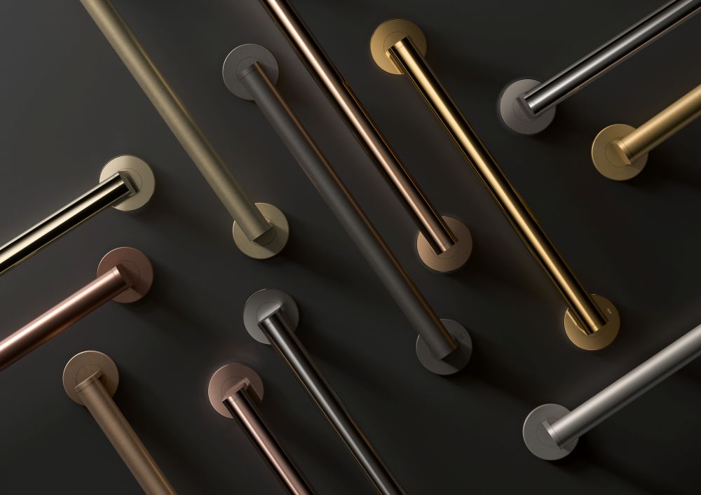
HEWI is introducing new surfaces using the environmentally friendly PVD process to achieve maximum individuality in the bathroom.
Delivering more glamour to the bathroom, HEWI adds new metallic designer surfaces, including options such as brass, bronze or gold. The latest designs can help transform contemporary sanitary rooms into personalised oases of well-being – be it in hotels, representative public buildings, elective surgery areas in hospitals or the bathroom at home.
Altogether, the manufacturer offers four new standard and eight new special colours for its accessible sanitaryware and accessories, all manufactured in the PVD process. This allows for even more diversity and scope for bathroom planning.
Timelessness, elegance, and style are what the newdesigner surfaces from HEWI stand for. With its sanitary systems and accessories, HEWI transforms sanitary areas and privatebathrooms into feel-good spaces with that certain something extra.
Colours and surfaces are particularly suitable elements when planning to design sanitary rooms that are in tune with the atmosphere of the surrounding architecture. Be it cool, calming,warm or revitalising – HEWI offersnew, inspiring colours and surfaces for selectedranges and systems to suit every customised design.
Decorative and durable
The wide range of options includes brass, bronze, gold or black chrome, with brushed or glossy finish options. They are highly decorative and emotionally appealing, but behind thedelicate, shimmering surfaces lie extremely robustand resistant properties. The PVDsurfaces are corrosion-resistant, ideal forsanitary rooms or rooms with highhumidity. They also havedurable properties such as hardness and scratch resistance.HEWI offers a total of 4 new standard and eight newunique colours.