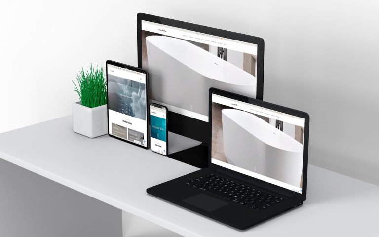
Acquabella has adapted its website to deliver an enhanced customer experience. The website often serves as the first point of interaction for its customers. Discover the new acquabella.com website.
Constantly prioritising the user experience, Acquabellla has to introduced a website that maintains the spirit of the previous site. But, there are now notable differences that will create a pleasant browsing experience, where the user can enjoy jumping from tab to tab.
Improved tab usability
The new acquabella.com website features drop-down tabs that allow direct access to the desired section, shortening the route visitors follow and reducing loading times. There’s now also a much clearer and more visual division.
Welcome, Dolotek®
Acquabella has created a materials section where they explain in detail the characteristics, advantages and maintenance of Akron® and Dolotek®, the DNA of Acquabella products.
Interactive zone
This highly interactive section gives a product presentation an almost game-like feel.
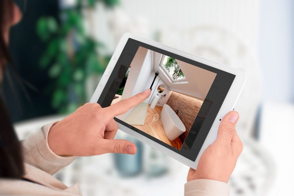
Discover the Acquawhite catalogue from the “interactive catalogue” section. It’s a highly visual catalogue where users can discover products in detail, complete with environments that will transport customers into the photograph thanks to the 360 spaces, hotspots that provide more information on each product and, of course, each series’ products broken down individually.

On the other hand, the 360 environments transport users to the interior of an Acquabella bathroom, where they can move at will and enjoy a complete view of the room, from floor to ceiling and in all possible directions, with the user in control at all times.
You’ll find all this and much more if you visit the new acquabella.com website, a page designed for enjoyable browsing. But, since a picture is worth a thousand words, we invite you to take a look at it and see for yourself.


